Redis is an enterprise database company: developers build on it, and the organisations around them buy it, operate it and scale it. I built the research operating system for that company — a unified protocol from intake to archive, the Critical User Journey program run across four journeys, a Voice-of-Customer program with its own self-serve dashboard, and — for the hardest journey, migration — an interactive map I designed with Claude and built with Claude Code, deployed on Vercel, solo.
Critical user journeys — the end-to-end routes customers take through a product to get something done, picked out because the business depends on them going well — are an established practice; I brought the program to Redis and ran it across four journeys. What's mine is the two layers I added — the step, a cognitive unit sitting between journey and task, and CEOA, the model that turns a journey into a benchmark you can re-run.
Four dimensions, read at every step and weighted by insights rather than by how the room felt on the day. Where to start becomes a location, not a verdict — and every fix gets a return trip.
clarity · efficiency · orientation · aesthetics
A team owns an area. A study tests a screen. An experiment moves one number, and everything is measured on its own terms, inside its own boundary.
But getting a database into production, working out why latency spiked at 3am, moving off another vendor — every one of those crosses areas, teams and screens. Research organised by feature can tell you each piece works and still never tell you the route through them does.
Not that the wrong things were being measured — that the thing customers actually experience had no unit at all.
Pointed at journeys, one study produces findings several teams can act on at once instead of one.
You can't run this on every journey, so the first decision is which ones earn it.
A journey is a start point, a goal, and all the tasks between them — keeping it that plain is what stops "journey" drifting into "flow" or "funnel". A path is one way through; a journey usually has many, and you map the happy path first, because until it exists there's nothing to hang an edge case off.
A step is a cognitive unit — one thing the user is holding in their head at a time. Not a screen. The interesting failure is the step that has no screen, and you can't find those by auditing the interface, because the evidence isn't in the interface.
Dividing a journey into steps is the highest-leverage thing this framework does. A researcher who defines nothing but the steps of a critical journey, and stops there, has already changed the product.
A journey is big enough that no single method covers it. I ran all eight across the four journeys, scoped per journey to what it could be seen through — migration on behavioural data, sales calls and tickets, because its failures happen off-screen; onboarding on usability testing, because you can watch it happen.
moderated usability tests · unmoderated usability tests · user interviews · stakeholder interviews · stakeholder scoring sessions · competitive analysis · behavioural data · support-ticket analysis
Traditionally the stakeholder session is where scoring happens: each person walks the route and rates it, step by step. I kept that, for a reason with very little to do with the score. One of the program's goals was to get the whole organisation engaged in user experience research and decisions, and there is no faster way to make a VP care about a step than to have them walk it and put a number on it themselves.
So stakeholders influence the result twice, through two different doors — and a stakeholder's real leverage turns out not to be the number they wrote down, but how much they noticed. The mechanism rewards attention rather than opinion, from exactly the people who own the fixes.
Their score does enter the calculation — deliberately at a lower weight, because a room full of people who built the thing is not a room full of people using it.
The same session generates insights, and those carry the same full weight as any other finding in the corpus. No discount applied.
Notice more, move the score more. A stakeholder's real impact scales with the insights they produce.
A stakeholder isn't asked how a step felt. They read it four separate ways, against four named dimensions — the same four everywhere. Naming them is what converts an opinion into a measurement, and because they never change, a step becomes comparable to another step, and a journey to itself six months later.
Clarity — quick to read and understand · Efficiency — few steps, low effort · Orientation — always know where you are, what's next · Aesthetics — visual confidence
Every insight is tagged to one dimension at one step and weighted by impact. Steps carry their own weight too — where a live migration can fail is not where a customer is still deciding. The arithmetic is then unforgiving: a dimension starts clean, and each insight filed against it takes it down.
Out comes a benchmark — and, worth more, a ranked list of fixes, each attached to a step, a dimension and an owner. The number gets the meeting. The list gets the work.
A list of insights sitting in a research report is still a research report. The move that changes that is small, and it is the whole game: product managers add their own tickets to the insight list.
Each insight becomes a row with a ticket attached, filed by the person who owns the fix. Nothing about the research changed — but the list is no longer something research is asking product to read. It's a shared object product is writing into, and every item on it now has a name against it and a place in someone's backlog.
That's how the program recruited its own supporters. A PM who has put three of their own tickets against a journey's insights has a stake in that journey's next score, and will ask for it. Research stops chasing adoption and starts getting pulled.
Then you run it again — same journey, same dimensions, same steps, same weights — asking two questions. Are there new insights? And did the score improve where the tickets landed?
The comparison is never to another journey and never to an industry figure. It's to this journey, before — so "did it work?" gets an answer instead of a guess, and the answer belongs to the team that shipped the change.
Four critical journeys across the product: onboarding, monitoring & alerts, migration, billing.
Migration is the one that outgrew the report — the journey nobody could see whole, which became an interactive map. That chapter is further down this page.
50 external users, CEOA workshops with internal experts, 10 products compared — 37 insights, 11 high-impact issues, one revenue-blocking bug fixed.
The incident workflow audited end to end, with a competitive review of ~14 platforms — 63 insights.
Four steps × multiple entry paths × three layers, triangulated from mixed-method evidence.
The fourth journey, and the broadest of them: it spans many different personas and several separate workflows rather than one route with one actor.
A monthly report is not a document. It's an operating rhythm — and the interesting part is what it takes to hold one for fourteen months.
In May 2025, I was asked to monitor three things: NPS, off-boarding interviews, and the win-loss program.
What I proposed was a program with a publication attached: one document a month, assembled from every instrument we had pointed at the customer. Four populations, four moments in a customer's life.
The argument it kept arriving at was that churn was structural, not emotional. Customers weren't leaving because the product wasn't valuable, but because they couldn't figure out how to get started, hit reliability issues early, or found that pricing no longer matched their growth. That moves the leverage from build more to onboarding and support. Dozens read it every month, across the CTO and product organisations.
By the time I left, the report's initial data curation had been done by AI; I did the analysis, then edited and published it.
The only one where a new question could enter the same month it was asked.
Every customer who deleted a paid subscription.
The buyer's side of a deal that just closed. A population no product instrument reaches.
The org's existing number, finally read next to three streams that could explain it.
A weekly interview, with a product manager or the relevant stakeholder sitting in.
The outline for each conversation was generated with Claude Code before the call — from behavioural data on what this person does in the console, the CRM, a year of support history read for recurring trouble, sales calls and the open web. It injects two or three tailored probes underneath the specific questions they bear on, so the research rides on the outline where it becomes relevant.
Then the part that made it a system. A product manager's question went into my notes as an open task with its own relevance condition attached, and every prep run read that register and decided per interview. One asked about cost tooling on a Monday; by Wednesday a founder's outline carried it — a standing question multiplied by this person's researched reality.
Sent to the customer through a guide inside the product itself, while they're using it.
Who they are, what their company does, and what they've been doing in the console lately — including where they got stuck. Pulled from Salesforce, Zendesk, Chorus, Amplitude, Gmail and the open web — and nothing is attributed until name, company and email domain agree.
It fits the customer to the personas template and pulls the matching outline — one that changes which questions get asked, not just the wording.
Checked against this person's persona and their company's profile, and worked into the outline if it matches.
Something worth asking about in their own product activity gets written in under the specific question it bears on.
A first AI analysis pass, then my own — what survives becomes part of the monthly report.
Two things had to exist before this section could: a survey worth trusting, and a way to read it at scale. The survey was flawed, so I redesigned it — The Redesign, its own chapter on this page. Reading it at scale needed a tool, so I built one — The Dashboard, and it didn't stay mine: people across the org use it too.
The redesigned survey, the dashboard, and an AI pass on top of both are what turned this into a monthly practice instead of a one-off pull. Together they gave me a real read every month instead of a glance, trends followed across editions instead of reconstructed from memory, and stakeholders pointed straight at the data that mattered to them.
This one I didn't own, and the distinction matters. Win-loss at Redis was a vendor program run by product marketing: an external firm calls the customer-side buyer on deals that just closed — won and lost alike — and rates what drove the decision. Our research team was given access in late 2025, as guests of somebody else's program.
I connected to the program's API and put an AI agent behind it: for every deal, it joins the vendor's call to our own CRM, account discussion, sales calls and support history — and the support history is what changes the story. A lost expansion looked like a service-quality problem until the record showed support had proactively monitored their performance test months earlier. The deal stops being what one buyer remembers and becomes what actually happened between the two companies.
Everything else reaches people who use Redis. This reaches the person who decided — including those who decided against us — while it's still fresh.
Most weren't losses to a rival at all — a freeze after an acquisition, an architect laid off mid-cycle, a team concluding open-source was sufficient.
The API returns any deal touched since a date, so old interviews resurface and silently double the counts. Keeping only deals first published that month is the difference between reading a dashboard and owning a dataset.
NPS (Net Promoter Score) gets dismissed a lot, and there's a real case for it — a single score doesn't tell you much on its own. What it's good for is trends, and that's mainly how I used it: the all-time line as the headline, with a significance test on every move, so a bad month couldn't be read as a story it wasn't.
But the comments did something the score couldn't: spotlighted single incidents worth telling the org about — a support ticket handled well, a sales relationship worth reflecting on — written up with whoever did the work credited by name. When an interesting company's story surfaced, I'd use it to tell the org who they are and what their business with us actually looks like. Naming people wasn't just kudos — it's what pulled them into reading a UX report they'd otherwise have skipped, and that's most of how the org's own sense of the product's UX state grew.
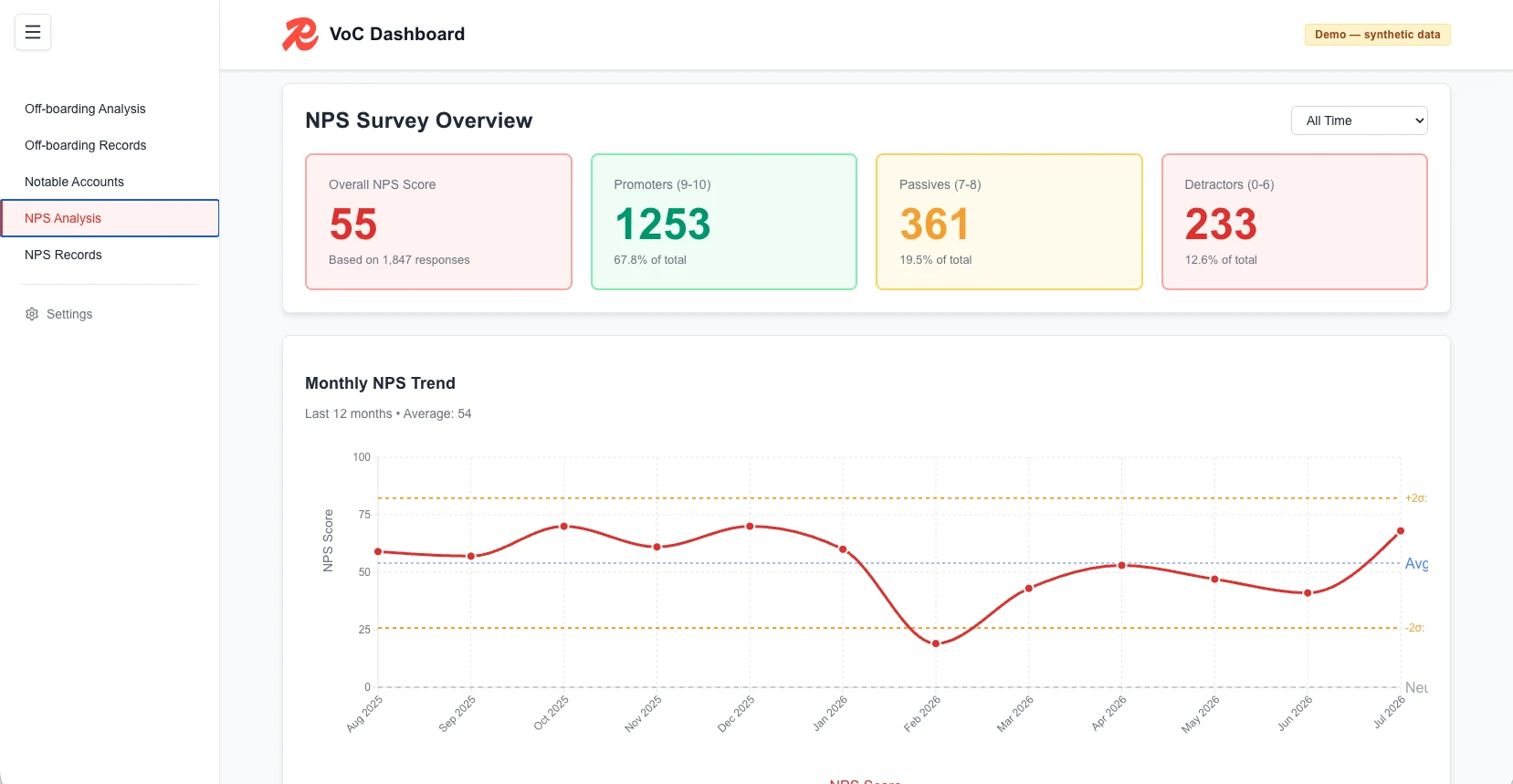
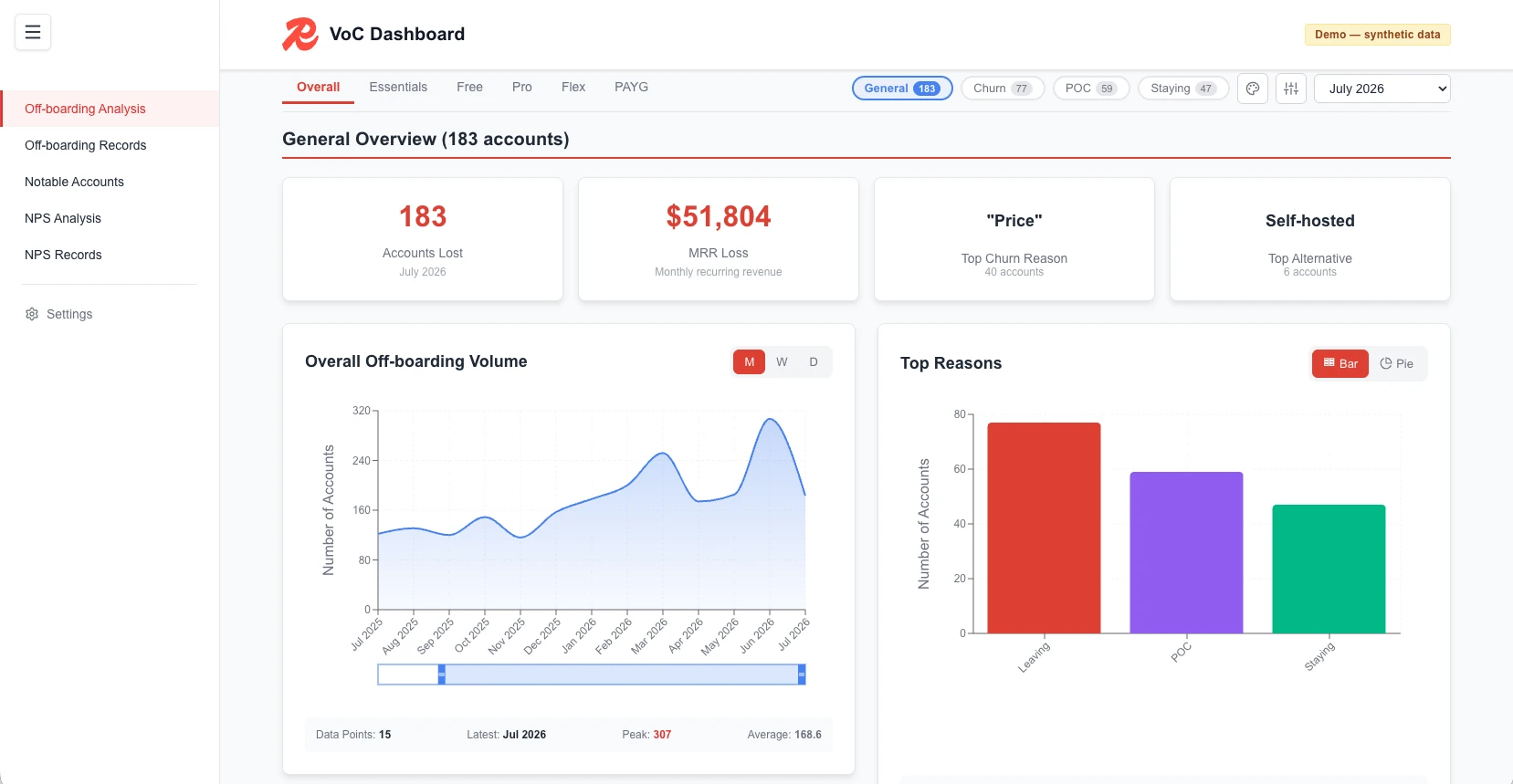
It analyses and visualises the data behind the monthly report — and then it was handed over: stakeholders ran their own analysis in it, and used it to share what they found.
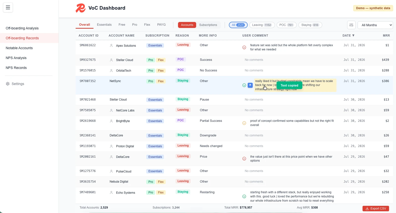
It began as the off-boarding dashboard — one page of charts over the survey's data. It grew into every number the monthly report quotes, put where the org could reach it directly.
It runs on no backend at all. The analysis happens in the browser.
a PM could ask which Pro-tier accounts left for a competitor last month, biggest first — and take the answer out
I kept noticing people double-clicking rows in the table, and assumed I'd built something confusing. There was never a double-click handler to be confused by — they were double-clicking to select a word, dragging across the row, and hitting copy, the only way to get a record into the document they were writing.
So it wasn't a broken interaction. The tool had no export path at the grain people needed — one row, one quote — and they'd invented one out of text selection.
The fix took three passes: a camera on every chart; cell-level copy, where the whole cell became the click target, because hovering to find a small button and then hitting it is two acts of precision to retrieve one string; then Markdown export. Copying a comment doesn't give you the comment — it gives you a blockquote carrying the segment, the reason, the destination and the account's worth, in the units the report speaks in. Copy isn't a clipboard operation; it's a format conversion between two documents. And I only know any of this because I put analytics on my own research tool.
M takes the Markdown version — the blockquote with the segment, reason, destination and account value already in it. The toast is the only part that exists purely to reassure.A survey, a CSV, and a Tableau page I needed a data-team ticket to change. It could show me that customers were leaving; understanding why was somebody else's sprint. Each tool below arrived because the one before it hit a wall.
The AI wrote nearly all of the code and none of the decisions — discuss the idea, have the model write the architecture document, rewrite that document yourself, then define what "this step worked" means before starting. Don't outsource your mind to the machine.
Every churn figure Redis quoted came out of one survey. It was optional, it arrived after the customer had already gone, and it asked a single question with sixteen answers in one flat list — among them “I want to upgrade my database.”
Monthly responses more than tripled once the redesign was live — the same instrument, now asked while the customer is still there. The root cause is still open: there is no delete account control, so a customer leaves one subscription at a time — which is exactly why the survey fires where it does.
Five of those sixteen answers describe somebody who is not leaving. The instrument had a taxonomy error at its root: it collected kinds of event as though they were reasons for one.
So the whole redesign reduces to a single move — ask one question before asking for any reason at all.
The survey fired after the deletion. So it could answer a customer who said too expensive with a page about cheaper plans and a migration guide — addressed to somebody whose database was already gone. Everything it collected was a post-mortem and everything it offered arrived for a person who no longer existed.
It asked one question with sixteen answers in a flat list, and among them sat “I want to upgrade my database”, “create new subscription” and “I was using Redis as a proof of concept.” Those are not reasons for leaving. A deletion is often routine work — there was no way to move a database between plan tiers, so upgrading meant deleting and recreating — and the instrument was adding three different events together and calling the total churn.
And it had no denominator. A thin monthly trickle answered it; out of how many, nobody in the company could say. There was no agreed definition of a churn event at all. I chased that number for months and never found anyone who had it — which turned out to be the real finding. The survey wasn't asking badly. The organisation could not count the thing the survey existed to measure.
It fired after the deletion, so nothing it learned could be acted on and nothing it offered could be accepted.
Force too many answers and people abandon — or back up and change the one they already gave. That is why it stayed optional for years, and why making it mandatory had to buy something specific.
A trickle of answers a month, out of an unknown total, against an undefined event. A rate with no base is not a measurement.
the flaw is legible in the option list itself — you never needed the data to see it
It started as archaeology. The live survey couldn't be found or reproduced, and both people who built it had left. So I tracked down a developer who still had it, got a JSON of its structure, and had Claude Code turn that into a working demo — which is how I finally saw what I was replacing.
The demo is what I did the work with. I walked product leadership, customer success, support, growth and design through it one at a time — people could click the survey instead of reading a document about it, and every session handed back something the design had got wrong. Customer success broke my screening question outright: customers call any Redis-compatible database “Redis”, so a question the respondent cannot answer correctly is not a question.
What I had specified first was elaborate — customer segments, a different intervention per segment per reason. The walkthroughs talked me out of it. Segmentation by customer value lives in a CRM and is wrong the moment the record goes stale; segmentation by intent is answerable by the person in front of you — are you leaving, running a proof of concept, or staying and changing something? That is the whole redesign, and it is one question.
the distinction was always in the answers · the redesign moved it into the question
Making somebody answer on their way out is real friction, and reducing friction is the UX default. So I argued the trade in the open: one to two months of complete data as a baseline, some users lost to it, and a Skip button once the baseline exists.
And it went out one zone at a time, widening to the whole fleet by mid-January 2026 — the gate was live in front of real customers in one region before it was live everywhere.
a gate on the deletion, not a wall in front of the user · two questions deep from any branch
Redis Cloud's navigation had grown the way product navigation grows — one feature at a time, each addition sensible on its own, nobody asking whether the categories still made sense together. I noticed it first in interviews, in the pause before someone chose a menu item, and tested to confirm it was real rather than a thing I had started seeing. Then an AI caching service arrived with nowhere to put it, and the question stopped being deferrable.
The temptation is to sit down and design a better menu. The people who know where a thing belongs are the people who go looking for it — so the whole method follows from taking that literally.
Thirteen of the product's own terms, handed to forty engineers with no categories at all. Then three rounds of putting the answer back in front of strangers to see whether it held.
the map at left is round three · the number on each term is how many of twenty put it there
The product's main navigation bar was confusing and unintuitive. Users couldn't find their way around.
Nobody assigned this. It surfaced sideways — in interviews, and in watching people work the console while we were there for something else, the same small hesitation appearing in front of the menu. So before proposing anything I ran usability tests, to check it was a real problem and not a thing I had started noticing. It was. That is when I opened the ticket and started the study.
How should the cloud pages' menu be reorganised to improve navigation efficiency and reduce user confusion?
Where does a brand-new capability belong inside a structure that predates it? The question that forced the study is a question the study has to keep answering.
Measured how — and decided before the first card moved. Task success and time-to-completion in a tree test, which is a commitment to a number that could come back wrong.
the hypothesis was written before the method ran, and it named its own failure condition
then the route: an open sort · three closed rounds · the result tested against the menu already live
An open sort hands over the vocabulary and none of the structure: here is what the product calls itself — make whatever piles make sense, then name them.
It ran on a panel of software engineers screened for recent hands-on work with a database platform — Redis one qualifying answer among thirteen, and never required. What comes back is not an opinion about the menu but a picture of where people expect things to live.
40 participants · every card carried a tooltip, so the sort could never become a vocabulary test
The matrix says what belongs together — in two readings, five groups or four, and it can't choose between them. It says nothing about what to call a pile, and the name is what a user clicks.
The pile holding Databases and Clusters drew five names: the same objects at five different altitudes. That spread is the finding. The structure is stable and the vocabulary is not.
so you stop sorting, and start testing named sets against each other
A closed sort inverts the first one: here are the categories, put the cards away. Three rounds, twenty fresh participants each — people who had never seen the study, which is the only kind a navigation ever meets.
A category a third of people miss is not a category. It is a coin toss with a label.
round one tested five groups · rounds two and three tested four
Put all three rounds on one axis and the shape appears. Round one to round two is a real lift — the five-group split being wrong, and being fixed. Round two to round three is flat: the last two were a dead heat.
So the choice between them wasn't statistical. Advanced features is a label defined by what it isn't — it ages the moment the advanced thing becomes ordinary. Services names what those things are, and stays true when the next one arrives.
Knowing when the evidence has stopped discriminating is part of the method, not a failure of it — so name the judgement as a judgement, and leave the record for whoever inherits the menu.
thirteen cards, three rounds · the marked line is the mean, and it goes flat
A card sort tells you what people expect, not whether they can find anything — and certainly not whether the new thing beats the old. Different claims, different instrument.
So validation ran as an A/B tree test — eight scenarios put to both the proposed structure and the menu already live, scored on arrival, then on ease and confidence.
Then the problem that made it interesting: the new structure held things the old one had no counterpart for, so there was nothing to test them against. Rather than fake a control I split the question — which is better where both can answer, can they find it at all where only one can.
The proposed structure came back significantly more intuitive than the one it replaced — not we think this is better, but both put in front of people who had seen neither, and this one won. Management / Services / Monitoring / Financial is what shipped, and it is what the console carries today.
Reaching the target section. Nothing else counted as success, and the tree was the only thing on screen — no labels, no icons, no colour to rescue a bad word.
Asked immediately, before the next task could colour the memory of this one.
A confident wrong answer and an unsure right one are different bugs. One is a naming problem; the other is a structure problem.
The wrong turn is the finding. The destination only confirms it.
the scenarios came off real pain points — and writing two of them meant going to check where the setting lived ourselves
CUJ3 was migration — one of the four journeys in the Critical User Journeys program I ran at Redis. Migration is a complex journey. So many paths run under the word that at some point I realized different people mean different things when they say it. I triangulated behavioral analytics, recorded sales calls, support tickets, user interviews, competitive analysis, and interviews with TAMs and CloudOps — and the synthesis surfaced reliability and discoverability gaps that reframed the roadmap.
The space has three dimensions, and a document has one. So I designed it with Claude, built it with Claude Code, and shipped it on Vercel.
4 steps · 16 entry paths · 3 layers
Migration is an umbrella term: moving a user's database assets from one place to another. Every part of that definition is vague — what counts as an asset, what counts as the place they leave, what counts as the place they arrive. That vagueness is not an accident of phrasing. When I talked to stakeholders, nobody held the same boundaries for the word.
So the first deliverable was not a map. It was a definition — what a migration is, what its subtypes are, and what all of them have in common.
No single source could describe the space — and the people closest to it did not describe the same space.
Product managers saw migration as a customer arriving from another vendor, wanting to move their data in. Support saw a customer changing how they pay, moving billing off a cloud marketplace and onto a credit card. Technical account managers and CloudOps saw an infrastructure process: a change to what the data is written to, rather than a move of the data at all.
All of these were documented, and all of them made sense. That is what made the knot worth untying rather than cutting.
The first cut was the paths, and there are two families. Path A is a customer arriving from outside — another vendor, another cloud. Path B is a customer moving between databases inside the platform, where nothing leaves.
Every path then runs the same four steps — cognitive units, not screens — and every step is made of three layers: data, infrastructure, control plane. Not every layer is relevant at every step of every path, which is why the map has empty cells, and why an empty cell is a finding rather than a gap.
The steps are where the sorting did its work. Most stakeholders I spoke to thought Execute was the whole of migration — the deciding, the preparing and the cutting over were somebody else's problem, or nobody's.
My answer was an interactive tool that holds every path, step and layer at once — carrying the research insights, the relevant support tickets from the preceding two years, and the conclusions from the CUJ study alongside the structure they belong to.
step × path × layer
The map drove the scope decision for the next phase of migration work, and then kept going — which is the part research usually doesn't get. It became the shared reference for a journey the org had never seen whole.
The next phase of migration work was scoped against the map rather than against the loudest stage.
One picture the whole org could argue in front of, instead of four partial ones.
To plan the roadmap, and to make cost-benefit calls on the next round of migration work.
Discovery, synthesis, design, agentic build, deploy — one person, no handoff, and no stage where the work had to wait for someone else's queue. That is the part I'd want a design lead to look at hardest: not that a researcher can ship an interface, but that shipping it kept the research intact.
I teach this workflow now.
Behavioral, conversational and competitive evidence, in one structure.
The interface worked out in conversation, against the shape the research had found.
An agentic build — the researcher who found the structure is the one who shipped it.
Live, gated, and in the hands of the people who make the roadmap.
That's what research leadership looks like when it builds.